What Makes A Good Poster Design? (And Why Most Posters Fail Without You Realizing)
Introduction
Imagine you’re walking through a metro station or your college corridor.
Posters are everywhere on the walls.
Now ask yourself: how many of those posters do you actually remember?
Most posters fail — not because they look bad, but because they don’t connect with you.
A good poster design is not about fancy fonts, gradients, or mockups. It is about
communication.
If you are taking coaching for NIFT, NID, CEED, UCEED or you are students preparing
for NIFT or design, poster design basics samajhna is literally your foundation.
Today, we’ll break down what truly makes a poster GOOD — in a way that juries and real-world designers genuinely respect.
A Good Poster Grabs Attention Before People Decide to Ignore It
Reality check: people don’t read posters, they scan them.
You have almost three seconds to catch attention. If your poster doesn’t hook the eye
instantly, it becomes background noise.
A strong poster usually has one dominant visual or idea that pulls you in. It doesn’t scream
everywhere; it whispers in a powerful way.
And honestly, if your poster looks like a default template, juries notice it instantly. Yes, they
have seen it a thousand times.
Message Comes Before Aesthetics (Yes, Even Before Your Color
Palette)
Many design students start with “Let’s make it aesthetic.”
But a good designer starts with “What am I trying to say?”
A poster should communicate one core idea clearly.
If the viewer feels confused, the design has already failed—no matter how beautiful it looks
on Instagram.
In design exams like NIFT or NID, clarity of concept often matters more than decoration.
Visual Hierarchy Is the Hidden Language of Posters
When someone looks at your poster, their eyes should move in a planned way.
First the main idea, then supporting information, then details.
This is called visual hierarchy, and it’s something juries silently judge.
A good poster feels like a guided tour, not a maze.
Why Typography Decides Whether Your Poster Feels Professional
or Amateur
Fonts are not just letters. They carry personality.
Using a playful font for a serious topic instantly breaks trust.
Good posters use typography with intention. The text should be readable even from a
distance, and it should match the emotion of the message.
Design entrance panels often zoom into typography choices because it reveals how mature
your thinking is.
Color Is Emotion, But Random Color Is Chaos
Colors are powerful psychological tools.
They can make people feel urgency, calm, fear, or excitement without a single word.
But random colors make your poster feel childish.
A good poster uses color to guide attention and create mood, not just to look cool.
And yes, if you can explain why you chose a color, juries LOVE that clarity.
Simplicity Is Not Basic, It Is Advanced
Beginner designers often fill every corner because empty space feels scary.
Experienced designers remove things until only the essential remains.
A strong poster breathes. It feels confident. It doesn’t beg for attention—it commands it.
Think about it: would you trust someone who keeps talking without pause? Posters need
pauses too.
Context Changes Everything in Poster Design
Where will this poster live? On Instagram? On a street wall? Inside a college notice board?
A good designer thinks about distance, lighting, and audience.
Design exams like CEED and UCEED value this contextual thinking because it shows
real-world design intelligence, not just software skills.
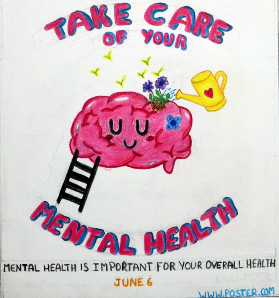
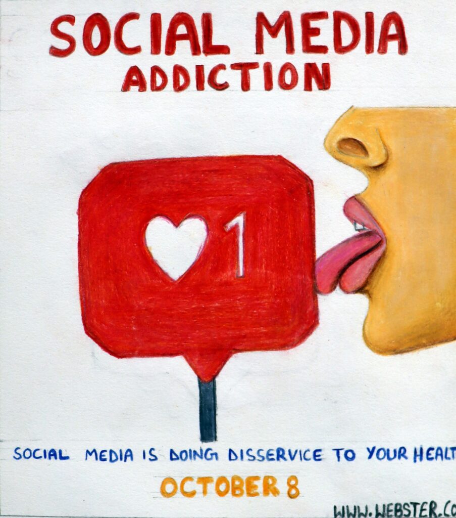
Storytelling Makes Posters Unforgettable
The posters you remember usually tell a story without words.
They use metaphor, symbolism, and visual drama to create emotion
This is where design becomes communication, not decoration.
And this is exactly what top design institutes want you to demonstrate.
Conclusion
A good poster design is not about Photoshop tricks or trendy mockups.
It is about thinking like a communicator, not just a decorator.
If you really want to grow in design, start observing posters around you.
Ask yourself why you noticed one and ignored another.
That habit alone will make you think like a designer—something every coaching for NIFT,
NID, CEED, UCEED secretly tries to build in students preparing for NIFT or design.
Design is not about making things look pretty.
Design is about making things clear, emotional, and impossible to forget.